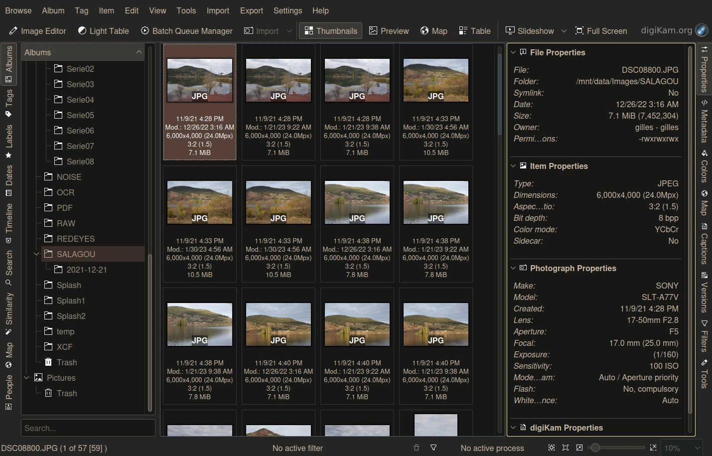
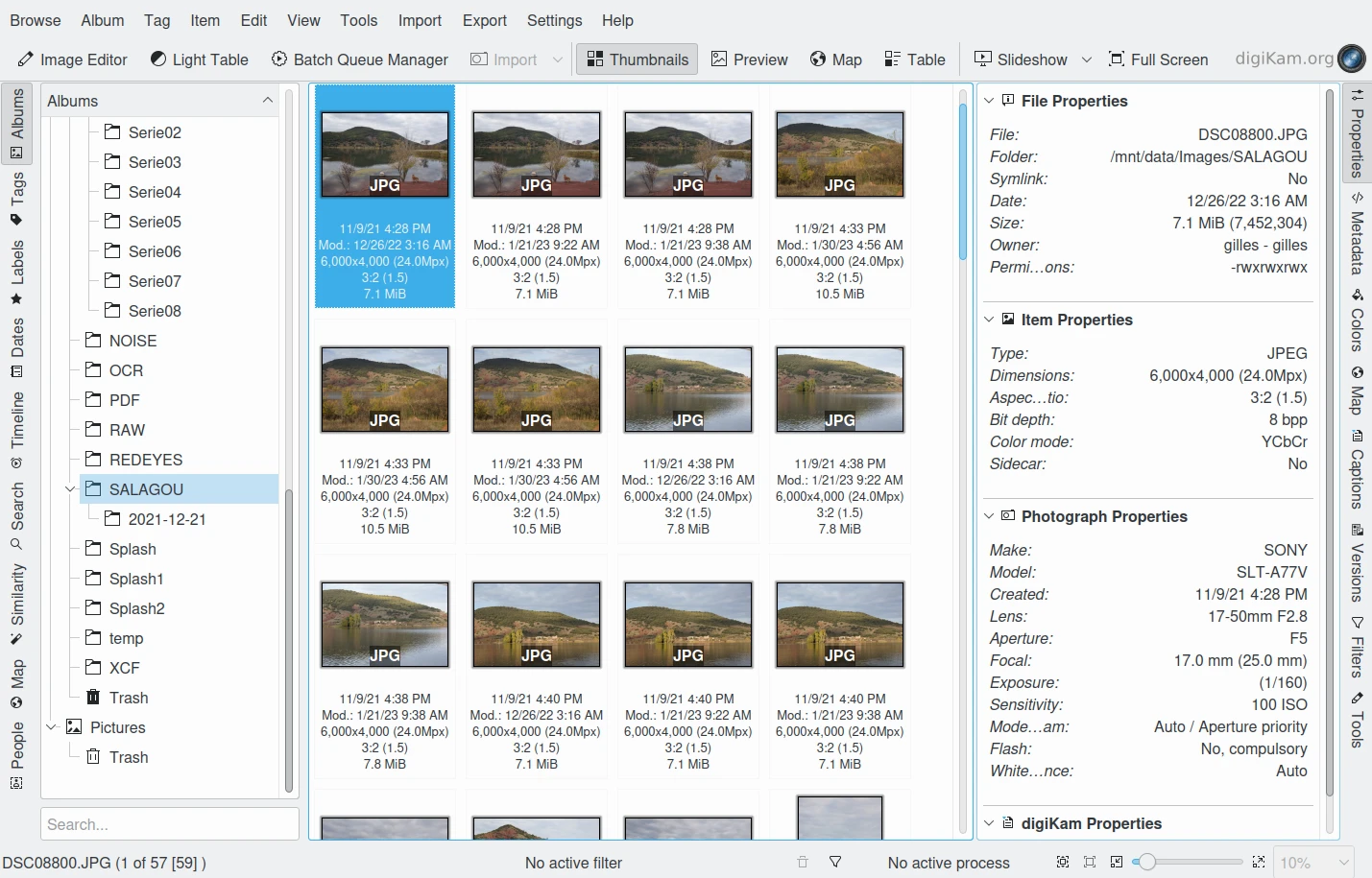
Theme Settings
Color themes are supplied allowing you to personalize the digiKam main interface. To access these settings select from the menubar and select your preferred theme.
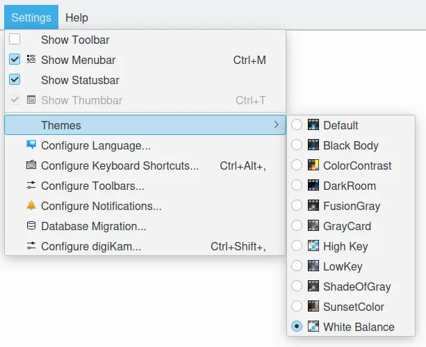
The digiKam Color Themes Menu
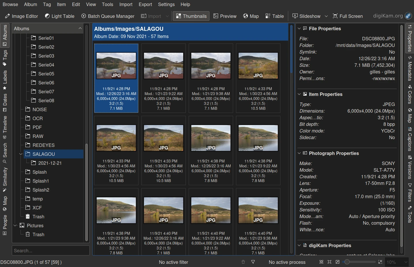
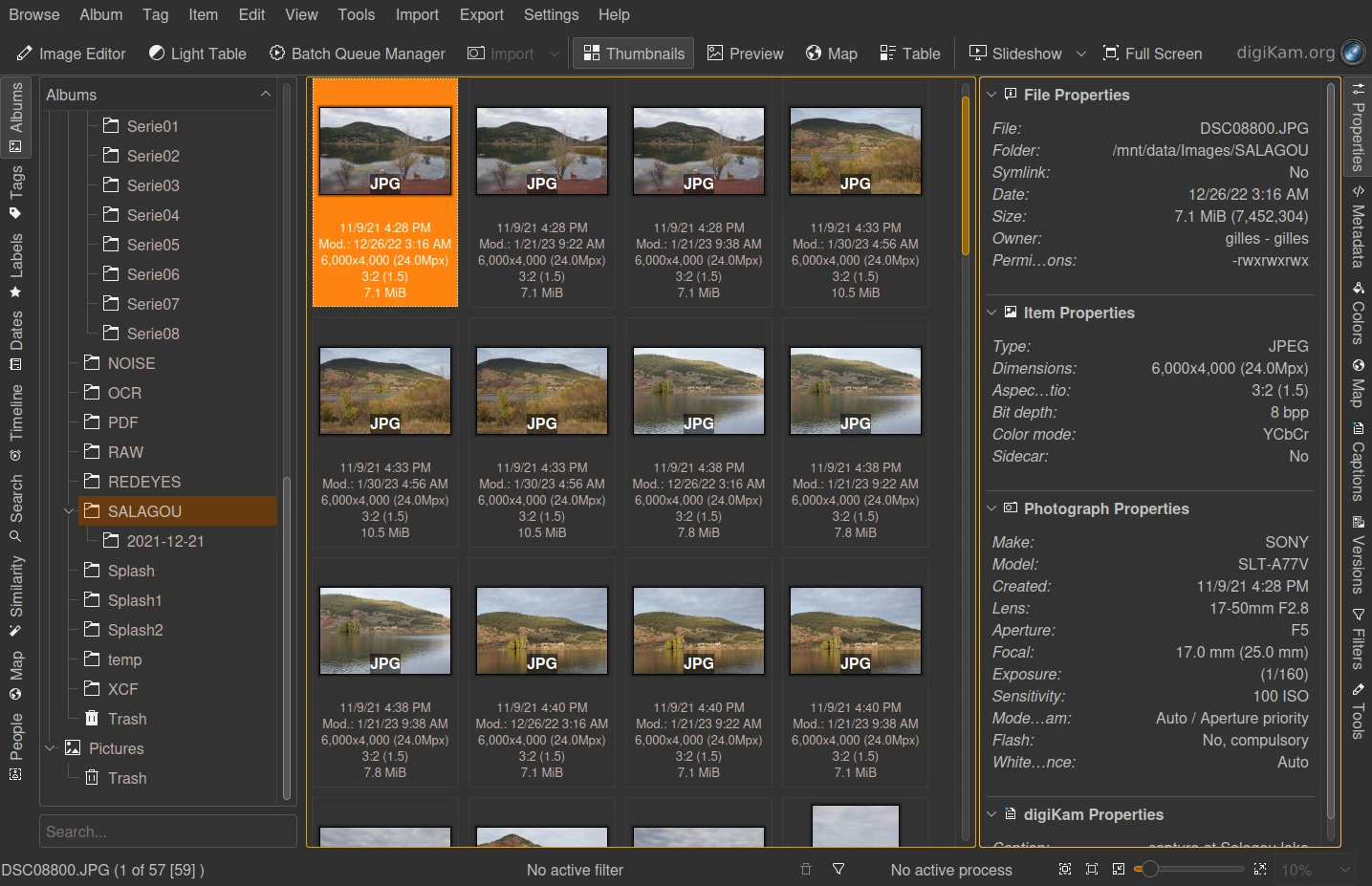
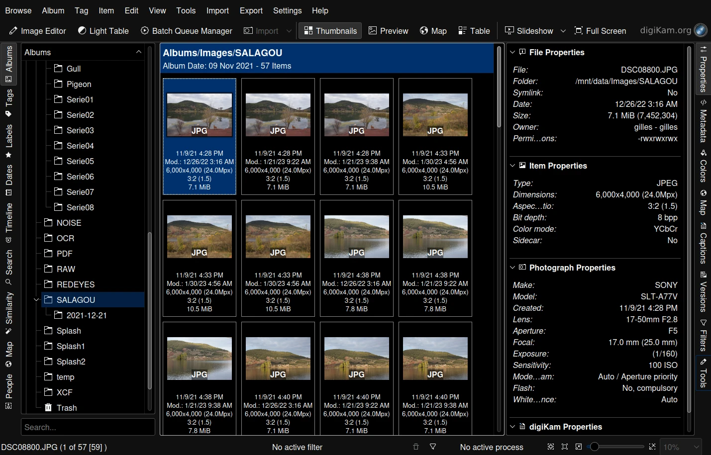
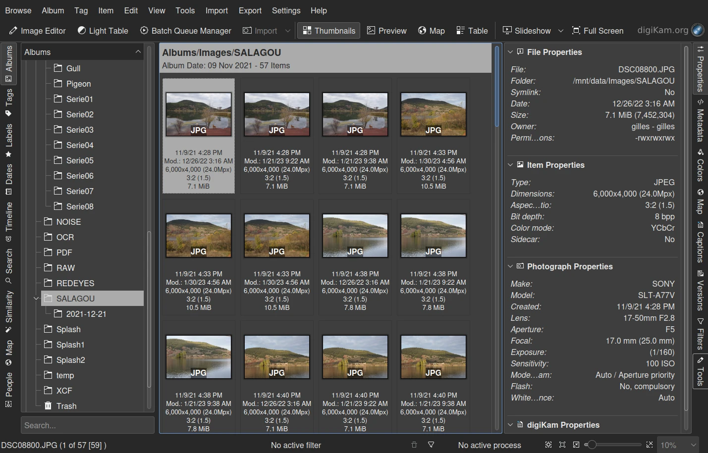
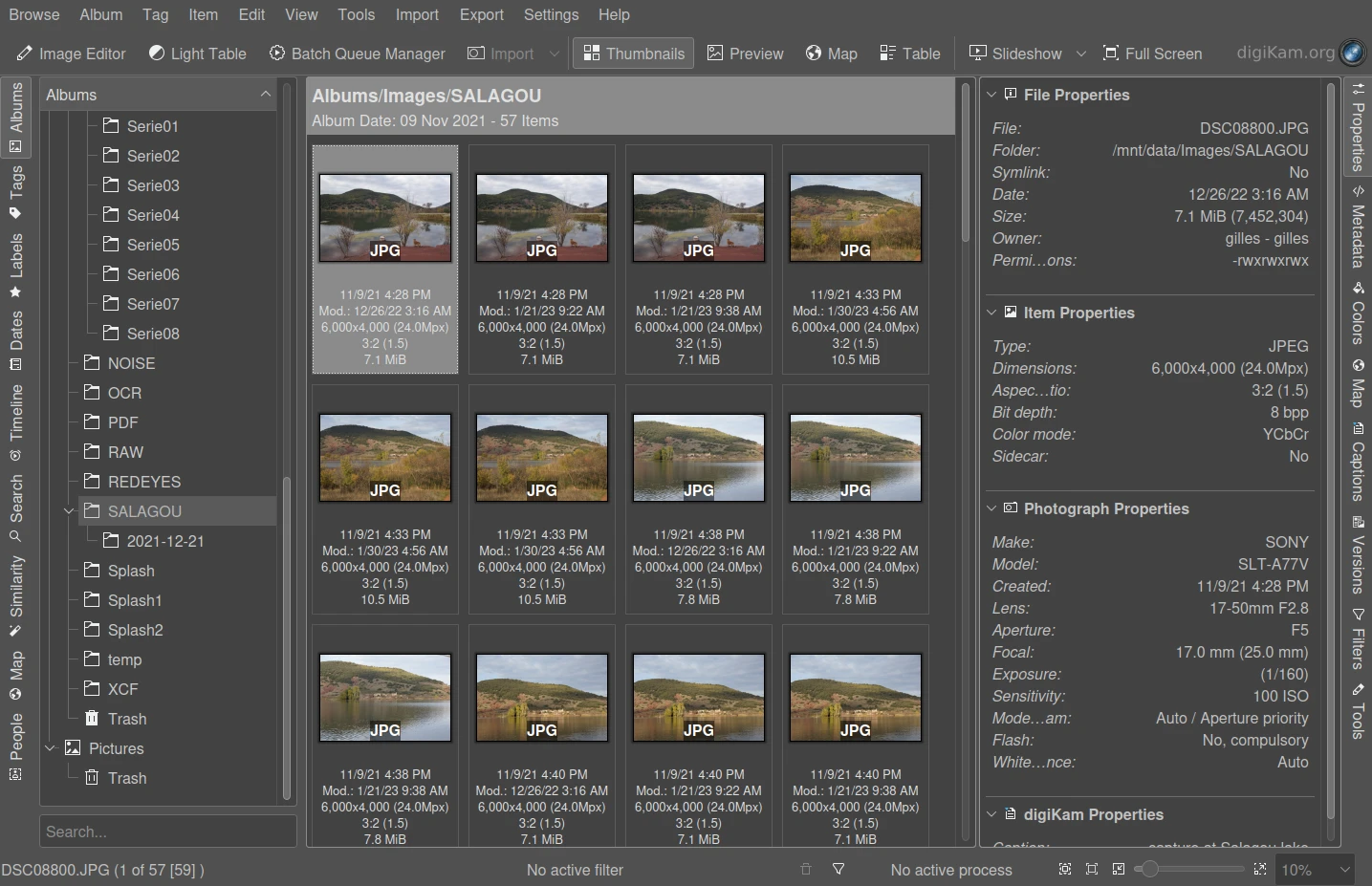
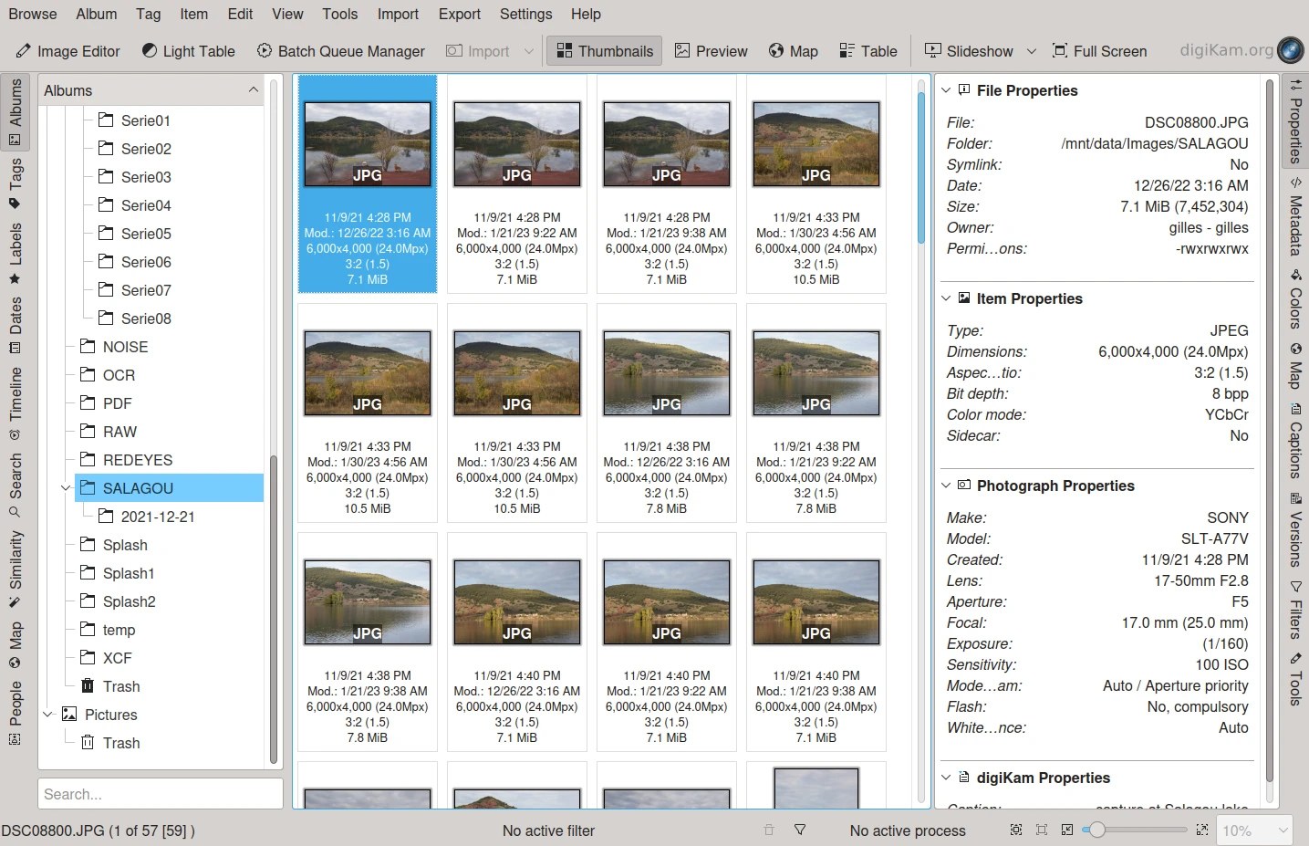
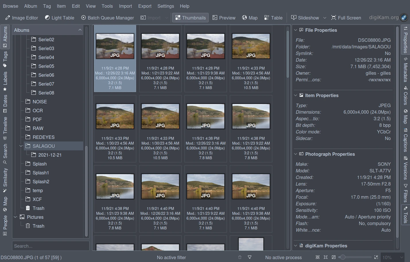
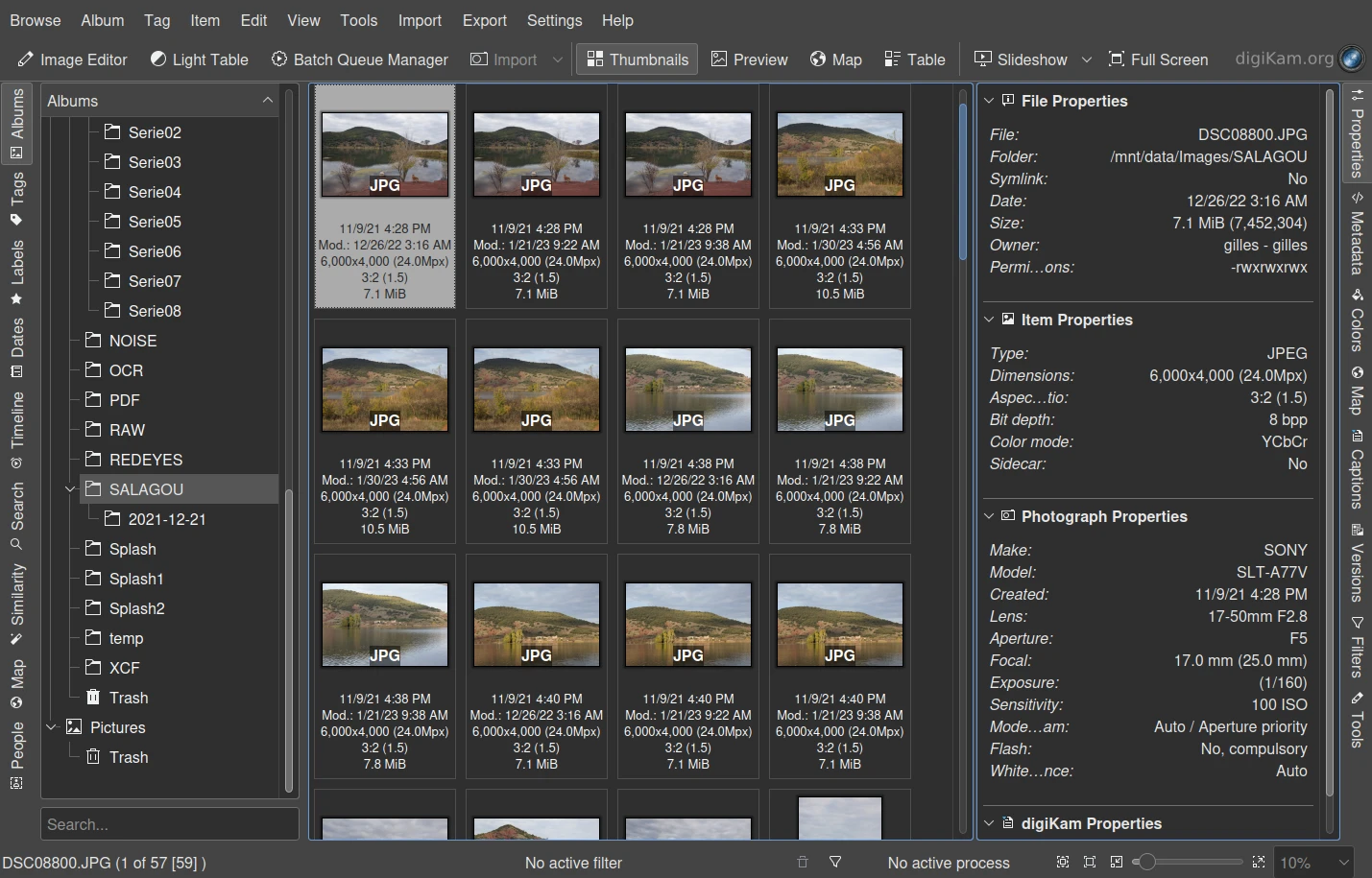
Selecting a theme changes all of the elements of the graphical interface consistent with the theme’s color scheme.
备注
Depending on the color theme you selected, you may have to restart digiKam to load all of the relevant icons associated with the new color scheme.
Some color schemes do not work well with some widget styles. So you may find it necessary to adjust the Widget Style from the , especially with dark color schemes. See this section of this manual for more details about the Appearance options.
the table below contains examples of the appearance of the Album-View with each available theme.
