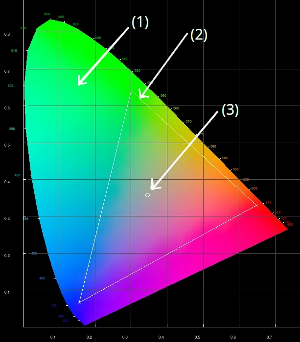
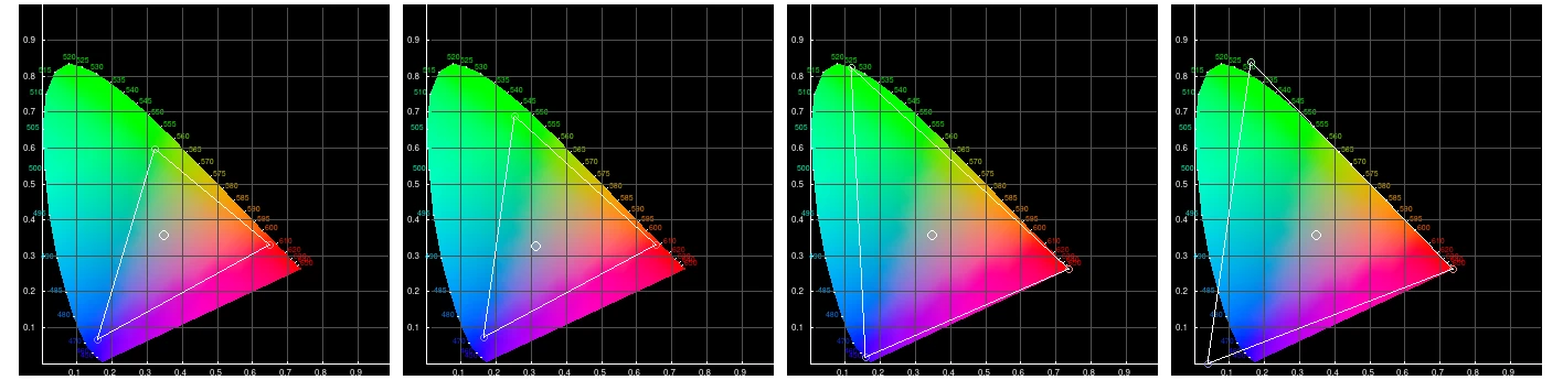
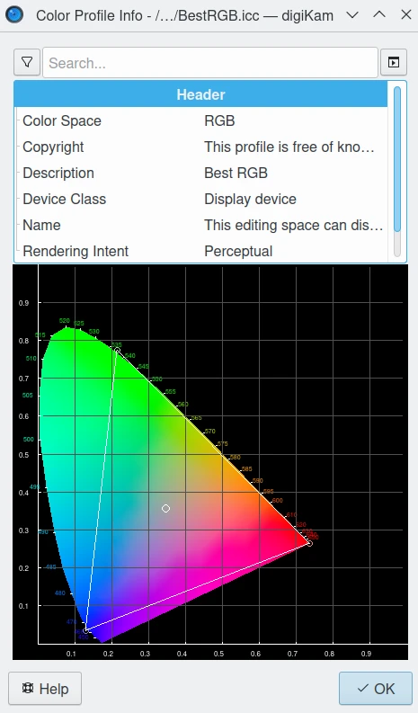
The Gamut (2) triangle defines the range of RGB colors that the profile spans. In other words, the color space can only represent colors lying within this triangle. RGB primaries define the corners of the triangle. The Red point is on the bottom right corner, Green is on the top, Blue is on the left bottom.
The White point (3) defines the neutral point in the gamut. The total dynamic range of the profile is measured relative to this neutral point.
The Gamma defines the usually nonlinear transfer function that is applied to the data (not displayed in the gamut).
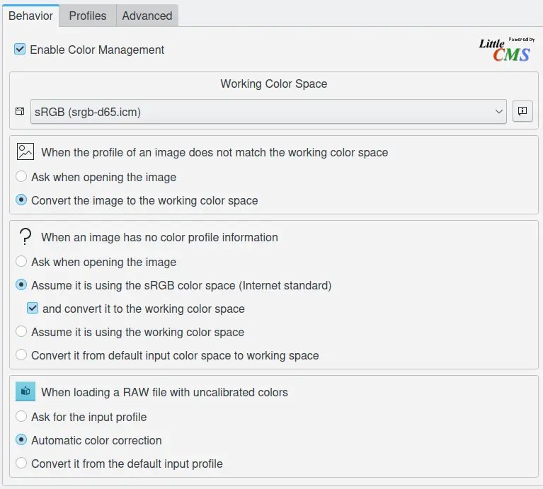
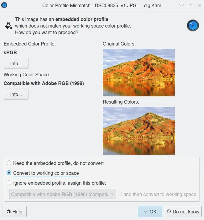
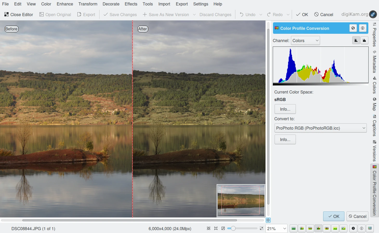
You can also switch color spaces from within the Image Editor. Select the Color Space Converter that can be accessed from the Tools tab in the Right Sidebar.
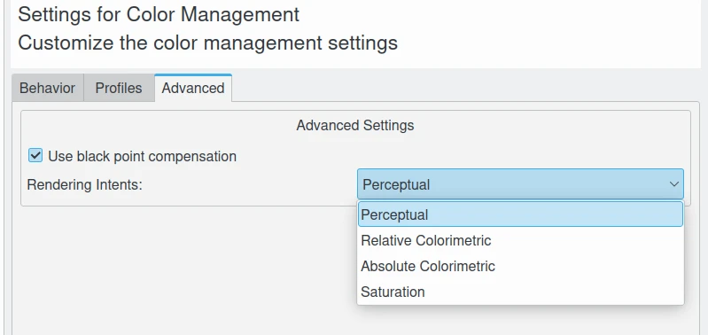
Rendering intent refers to the way color gamuts are handled when the intended target color space (for example, the monitor or the printer) cannot handle the full gamut of the source color space (for example the working space).
常用的渲染意图有以下四种:
Perceptual, also called Image or Maintain Full Gamut. This is generally recommended for photographic images. The color gamut is expanded or compressed when moving between color spaces to maintain consistent overall appearance. Low saturation colors are changed very little. More saturated colors within the gamuts of both spaces may be altered to differentiate them from saturated colors outside the smaller gamut space. Perceptual rendering applies the same gamut compression to all images, even when the image contains no significant out-of-gamut colors.
Relative Colorimetric, also called Proof or Preserve Identical Color and White Point. Reproduces in-gamut colors exactly and clips out-of-gamut colors to the nearest reproducible hue.
Absolute Colorimetric, also called Match or Preserve Identical Colors. Reproduces in-gamut colors exactly and clips out-of-gamut colors to the nearest reproducible hue, sacrificing saturation and possibly lightness. On tinted papers, whites may be darkened to keep the hue identical to the original. For example, cyan may be added to the white of a cream-colored paper, effectively darkening the image. Rarely of interest to photographers.
Saturation, also called Graphic or Preserve Saturation. Maps the saturated primary colors in the source to saturated primary colors in the destination, neglecting differences in hue, saturation, or lightness. For block graphics; rarely of interest to photographers.
Perceptual and Relative colorimetric rendering are probably the most useful conversion types for digital photography. Each places a different priority on how they render colors within the gamut mismatch region. Relative colorimetric maintains a near exact relationship between in gamut colors, even if this clips out of gamut colors. In contrast, Perceptual rendering tries to also preserve some relationship between out of gamut colors, even if this results in inaccuracies for in gamut colors.
Absolute is similar to relative colorimetric in that it preserves in gamut colors and clips those out of gamut, but they differ in how each handles the white point… Relative colorimetric skews the colors within gamut so that the white point of one space aligns with that of the other, while absolute colorimetric preserves colors exactly (without regard to changing white point). Saturation rendering intent tries to preserve saturated colors.