Monitor Profiles
sRGB Color space
sRGB is widely accepted as a standard color profile by virtually everyone involved with consumer-oriented imaging. sRGB was proposed in 1996 by Hewlett Packard and Microsoft as a standardized color space for consumer-oriented applications. As stated in the initial proposal:
Hewlett-Packard and Microsoft propose the addition of support for a standard color space, sRGB, within the Microsoft OS's, HP products and the Internet. The aim of this color space is to complement the current color management strategies by enabling a third method of handling color in the OS's and the Internet that utilizes a simple and robust device-independent color definition that will provide good quality and backwards compatibility with minimum transmission and system overhead. Based on a colorimetric RGB color space well suited to Cathode Ray Tube (CRT) monitors, televisions, scanners, digital cameras, and printing systems, such a space can be supported with minimum cost to software and hardware vendors.
Currently, the ICC (International Color Consortium) tracks and ensures that a color is correctly mapped from the input to the output color space, by attaching a profile for the input color space to the image in question. This is an appropriate approach for high end users. However, there are a broad range of users that do not require this level of color quality, a broad range of file formats that will never support color profile embedding, and a broad range of uses that discourage people from appending any extra data to their files. It is at this level that a common standard RGB color space becomes useful and necessary.
A common standard RGB color space addresses these issues by merging the many standard and non-standard RGB monitor spaces into a single standard RGB color space. Such a standard could dramatically improve the color fidelity in the desktop environment. For example, if operating system vendors provide support for a standard RGB color space, the input and output device vendors that support this standard color space could easily and confidently communicate color without further color management overhead in the most common situations.
To summarize, the point of the by-now almost universally adopted sRGB color space was and is to make life easier for consumers (no need to worry about color management), less expensive for manufacturers (no need to worry about compatibility between consumer-level digital cameras or scanners, monitors, printers, and so forth), and more convenient for displaying images on the Internet (don't worry about embedding and reading ICC profiles - just assume sRGB).
So if sRGB works so well and makes life so easy for everyone, why use any other color space and thus be forced to worry about color management issues?
sRGB was designed to contain colors easily displayed on consumer-oriented monitors and printed by consumer-oriented printers manufactured since 1996. This least-common-denominator set of viewable and printable colors - the technical term is color gamut - is much smaller than the set of colors we can see in the real world, much smaller than the set of colors today's digital cameras can capture, much smaller than the set of colors today's printers can print, and much smaller than the color gamut of the new wide-gamut monitors that are beginning to enter the consumer market. The gamut of sRGB is simply too small to use the wider color gamuts available today even at the consumer level. Conversely, if you don't intend to make use of an expanded gamut of colors at any point in your digital imaging workflow, then you don't need to worry about non-sRGB color spaces and all the attending intricacies of color management.
A visual representation of the gamuts of sRGB, Adobe RGB and DCI-P3 compared to the colors we can actually see in the real world appears in the figure below. It shows a two-dimensional representation of all the colors we can see (the horseshoe-shaped region) and the colors contained in the three named color space (the smaller triangular regions).
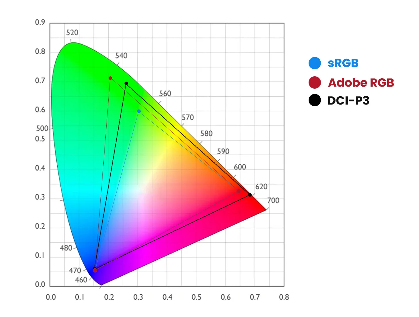
The Gamuts of the sRGB, Adobe RGB and DCI-P3 Color Spaces. sRGB is the Default Profile for LCD Monitors
It is interesting to note that this image itself has an embedded sRGB color profile, so the colors represented in the image do not represent the full range of colors that can be shown in the other color spaces.
Profiling Your Monitor
If you choose to work exclusively in the sRGB color space, do you need to calibrate your monitor? Whether you stay within the color gamut provided by sRGB or not, you need a properly calibrated monitor because sRGB assumes that your monitor is calibrated to sRGB.
There are several possible consequences of working with an uncalibrated monitor, none of them good. Every monitor, calibrated or otherwise, has a native (uncalibrated) white point, expressed as a color temperature in degrees Kelvin. The white point of a monitor (calibrated or not) is the color you see when you are looking at a patch of pure white on your screen. Pure white is when the RGB values in your image all equal 255 (as expressed in 8-bits), such as the plain white background of a web page or an office document. You are thinking, white is white but if you were able to line up several monitors calibrated to different white points, you would see that the higher the temperature of the monitor's white point, the bluer the screen looks in comparison with monitors with lower white points.
You can see this for yourself by using the controls on your own monitor to change the temperature up and down. Remember to put it back to its initial setting when you are done! Your eyes, which adapt quickly to a constant white point, will easily discern the screen getting bluer and yellower as you move the white point higher and lower. If your uncalibrated monitor is too blue, you will overcompensate as you edit your image, producing images that will look yellowish and too warm on a properly calibrated monitor. Conversely, if your monitor is too yellow because the color temperature is set too low (LCD native color temperature is around 5500K while sRGB assumes 6500K), your images will look blueish/too cool on a properly calibrated monitor.
Setting a proper white point is only part of monitor calibration. You also need a proper black point, brightness (luminance), and gamma (transfer) function. If your monitor is too dark because the black point is set too low, you will overcompensate and produce images that look washed out on a properly calibrated monitor. Conversely, if your monitor black point is set too high, your images will look took dark and overly saturated on a properly calibrated monitor.
If the brightness/contrast is set too high, you will assume your images have a lot more pop than they really have when viewed on a properly calibrated monitor, plus your eyes will hurt and your LCD screen will burn out faster.
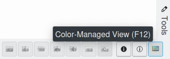
F12 Shortcut to Turn On/Off Color Management in the Image Editor and all digiKam Thumbnail Views
If your monitor gamma is improperly set, your tonal variations from dark to light will be off. That is, the shadows or highlights might be overly compressed or expanded, leading you to compensate in the opposite direction. So when viewed on a properly calibrated monitor, the shadows might be too bright or dark (or the highlights too dark or bright), with the rest of the image suffering from tonal over-compression. And heaven help you if the internal color channel gains of your monitor are improperly set, because the resulting color casts - too green, too magenta, too orange, etc. that you will inevitably create by correcting your image during editing - are very obvious when viewed on a properly calibrated monitor.
Whether or not your monitor is properly calibrated, you might be surprised by the results of comparing an image on your home monitor to the same image as displayed by other monitors in your house or on your friend's and neighbor's monitors. Typically, every image edited on one uncalibrated monitor looks very different on another uncalibrated monitor. You can buy calibrated monitors, or you can purchase a spectrophotometer to calibrate and profile your monitors.
You may be surprised that there is a difference between calibrating a monitor and profiling a monitor. Calibration is a process where a device is brought into some defined state by making adjustments to its controls or some other physical means. For example, the act of calibrating a monitor involves adjusting its white point, black level, luminosity and gamma to predetermined or standard values using the monitor's controls and by altering the video card settings.
In contrast to calibration, the process of creating a profile is a characterization of the device that does not involve making any changes or adjustments to the device. Rather it is a measurement process that results in a file that contains a precise mathematical description of the device's color and tonality characteristics. This file is an ICC profile. These characteristics include the transfer function from the device's color space to a standardized absolute color space (this is called a Profile Color Space in an ICC profile), the device's white point, black point, primaries and other information. Displays are normally characterized (profiled) in their calibrated state.
Calibrating your monitor technically is not really part of color management. But obviously a properly profiled monitor is a prerequisite for a color-managed workflow. This manual does not cover the important topics of how to calibrate and profile a monitor. The documents available at Argyll are very good and highly recommended reading. To use this software to calibrate and/or profile your monitor, you will need a spectrophotometer. A spectrophotometer (sometimes called a spider) is a device for measuring the RGB values of color patches projected onto the monitor screen by calibration/profiling software such as Argyll. The Argyll website maintains an up-to-date list of supported spectrophotometers.
Calibrating your Monitor
There are various methods given on the Internet for calibrating a monitor without using a spectrophotometer. These eye-ball methods are better than not calibrating your monitor at all, and depending your eyeball and your monitor, can produce quite usable results. But the eye-ball methods are not a true substitute for a properly calibrated and profiled monitor. For the record, calibrating and profiling a monitor with a spectrophotometer, though intimidating at first, is not difficult. Spectrophotometers can be obtained for well under 100€. (If you opt for a more expensive model, make sure you are paying for a better piece of hardware, rather than just a more fully-featured accompanying bit of manufacturer's software that won't run under Linux).
Argyll documentation will guide you through the process of calibrating and profiling your monitor, without your having to learn very much color management theory. And if/when you learn enough about color management to realize that you want or need a more detailed monitor profile of a particular type, for a particular purpose, the Argyll software have all the advanced capabilities you could possibly hope for.
Assuming you've decided to work exclusively in the sRGB color space, what digiKam buttons must be used after a monitor calibration? If your monitor has been calibrated to the sRGB standard and you work exclusively in the sRGB color space, then you can disable color management in digiKam. You don't need to tell digiKam what monitor profile to use because digiKam defaults to using the sRGB color space as the monitor color space profile. And you don't need to tell digiKam to use a color-managed workflow because digiKam defaults to using sRGB for your camera, printer, and working space.
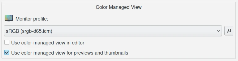
The digiKam Monitor Profile Settings from Color Management Setup Page
But if you want to take the first steps toward a color-managed workflow, then navigate to to enable color management in the Behavior tab, and then switch to the Profile tab to select sRGB as your monitor profile, your camera profile, your working space profile, and your printer profile. If you've also used Argyll to produce a monitor profile (preferably after you calibrated your monitor) named mymonitorprofile.icc, then tell digiKam to use it instead of sRGB as your monitor profile.
Monitor Profiles Storage
Windows, MacOS and Linux store their monitor profiles in different places.
On Windows, the default search paths include:
C:\Windows\System32\spool\drivers\color\
C:\Windows\Spool\Drivers\Color\
C:\Windows\Color\
On macOS, the default search paths include:
/System/Library/ColorSync/Profiles/
/Library/ColorSync/Profiles/
~/Library/ColorSync/Profiles/
/opt/local/share/color/icc/
/Applications/digiKam.org/digikam.app/Contents/Resources/digikam/profiles/
~/.local/share/color/icc/
~/.local/share/icc/
~/.color/icc/
On Linux, the default search paths include:
/usr/share/color/icc/
/usr/local/share/color/icc/
~/.local/share/color/icc/
~/.local/share/icc/
~/.color/icc/
Under Linux and macOS, your personal ICC profiles are generally located in the ~/local/share/color/icc folder from your home directory.
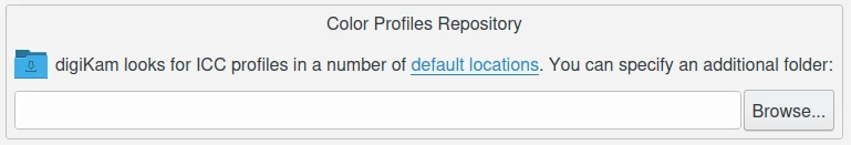
digiKam Allows You to Setup Customized Places Where you can Store your Personal Color Profile
Ambient Lighting and Monitors
Does the lighting and wall/ceiling/drape/furniture colors near my monitor matter? Yes. Good lighting is a prerequisite for proper image editing and for comparing prints to the image on your screen. If the lighting near your workstation is too bright (dark), colors on your monitor will look too dark (bright). If the light from the fixtures in your workroom have a low CRI (color rendering index, meaning you don't have full spectrum bulbs), or if the light in your workroom comes from a window and so varies as the weather and time of day varies (or worse, is filtered through colored drapery), or if the walls and ceiling are creating color casts on your monitor, then your editing process will correct color casts that don't really exist.
Although maintaining harmony in the family is important, our best advice is to paint your walls and ceiling a neutral grey, cover the windows, wear neutral clothing, and set appropriate light levels using appropriate bulbs and fixtures.